
RESEARCH
Defend solutions based on research.
THE BRAND
The brand engineered before the beginning of Mandy Madison’s MADMANZ March campaign was a conflicting one. As this is the tour for her very first album, research into her brand and the album was required to effectively represent her and the album.
According to How to Write Copy That Sells, effective copy is best written by chiming into a metaphorical conversation that is already happening in a client’s mind (Edwards, 2019). Mandy Madison, as an individual artist and brand, seems to have taken this to heart with her energy and music, matching this intention when making design decisions was key. Her brand is built in response to social controversy and putting her words into action, an answer to unspoken desperate pleas to address corruption and toxicity within contemporary American society. The MADMANZ March exemplifies this mentality.
This, itself, may not be so revolutionary – from Twisted Sister’s “We’re Not Gonna Take It,” and Black Sabbath’s “War Pigs,” Madison’s commentary on social issues is not new for the genre (even though these themes should be considered when designing) (MasterClass, 2021). The pattern throughout proves that this strategy of meeting audience needs is effective. However, Madison does so with a level head and steady control rather than reckless anger and abandon. This was something to be considered when creating a “visual tone” for the tour.
In the end, the aesthetics of it had to match Madison’s brand, the album, and the trends of her genre (metal) – controlled, measured chaos with a strong, underlying sense of community needed to be communicated.


Denim texture, acquired via Adobe Stock and recolored purple.

Color palette, developed via Coolors.co with color theory.

Initial pass of the "Look and Feel" concept of the tour.

Final model of the MADMANZ March Vision Board.
LOOK AND FEEL
There had to be a fine balance in this design – it had to communicate strife and struggle but show that the brand was the one defending and “holding a line” rather than being the aggressor. It had to communicate rebellion in the face of authoritarianism.
Typography
When considering line elements and text, sharp and rougher lines/shapes communicated hostility and aggression – this would contribute to the use of jagged shapes like torn paper and similar line quality to be used in the font to communicate these emotions (Lundin, 2023). Serif fonts show an element of simplicity, but the NCNDFV body typeface, seemingly written with a typewriter, indicated an air of sophistication and intelligence – its addition would soften the aesthetic, not to imply weakness, but to show that their perceived violence was not senseless. To contrast this, the seemingly hand-written or cutout HVD Rowdy header and BMX Radical subhead with their jagged edges and dry-brush quality would communicate the rough, hostile energy.
Shapes and Symbols
Next, key shapes were to be considered for framing and decorating pages. One shape that came to mind and would make prevalent appearances throughout the branding is barbed wire. Historically, barbed wire has been perceived as a symbol of oppression and warfare – it was something that saved the farmlands of the American West during expansion by protecting cattle and lands, but it also spelled the end of cattle drives, the American cowboy, and symbolized the beginning of territorialism in America. From then on, it would be used by all authorities from militaries and concentration camps during World War II to theme parks protecting their back lots (Zaretsky, 2008). This history was heavily considered when utilizing the shape, as the use of barbed wire in the branding was considered controversial. It risked leading the audience to the interpretation that Mandy Madison was the authoritarian fascist entity. However, this choice paid off by using it as a framing element that “bound” the others, seemingly trying to escape, within their borders. Jagged box shape elements would be used to contain text, further representing a rough, wild thing being contained by a symbol of militarism.
Color Palette
Colors were considered with the same care as line quality and shapes – even down to the physiological effects of the chosen palette. Red has symbolized rage, anger, passion, and love throughout history. Physiologically, it is known to raise blood pressure and heart rate when present around an individual in large quantities such as wall color, lights, and other substances (Susanto et al., 2020). The red chosen has a slight pink tint to make it not as jarring as pure neon red visually – it also added a feminine note, as pink has been associated with femininity in modern contexts, even going as far to be the color of key protest items such as the “pussy hats” from the 2017 Boston Women’s March (Kennedy, 2017). This influenced the red tone to be pinker to symbolize modern feminism rather than, say, orange, which would have weakened the design. The addition of purple, indicating power and authority, added a darker tone the palette would need for contrast. To connect the two key tones, an analogous palette with less saturated midtones softened the jarring tonal extremes and created a steady transition.
Textures
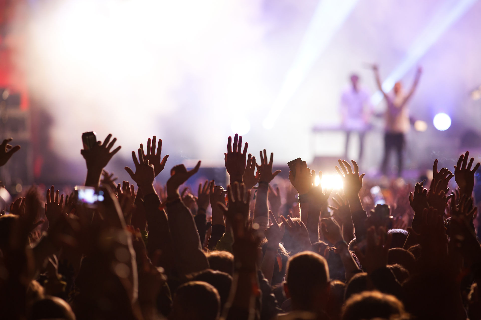
Texturally, many possibilities were considered for the aesthetics of the tour. The addition of denim, leather, ripped paper, and duct tape were all considerations made with modern alternative fashion and aesthetics. With the consideration that many of these textiles or surfaces are altered at home by the user, or have strong elements of “DIY,” it felt fitting for the aesthetics of the tour to match. This would bring the design thematically back to connecting to the audience. It shows that the band is not above them or better than them, but stands right alongside them utilizing the same daily materials, design styles, and intentions. To emphasize this aspect of community, all photographs utilized focus on either the audience’s point of view of the stage or focus on the audience themselves – it shows that the brand is not about the band, it is about the audience and how they connect as a community to become stronger together.
These cumulative concepts were only strengthened with the addition of polaroid-esque framing of the photos, which would eventually lead to the concept that all branding would appear scrapbook-esque, as if hand-made by a fan.
LOGO DEVELOPMENT
With the general “vibe” of the tour considered, it was time to develop the logo so that it could accurately match both Mandy Madison’s branding and the individual tour’s branding all while simultaneously communicating that it was a music tour rather than an actual insurrectionist group.
All of the initial thumbnails took inspiration from American Traditional tattoos to reflect Madison’s brand. Madison’s brand features this art style because American Traditional became an ironic symbol of rebellion after its origins in the American military forces evolved into a visible rejection of social norms in the 1950s (Phoenix, 2024). The pipeline from American militarism and alternative aesthetics, rebellion, and outright rejection of social norms is not lost here – but further cements symbolically the purpose of MADMANZ and the disillusionment of American citizens over time, making the utilization of this style a key aesthetic of the MADMANZ brand (“The art of,” 2023). Many of the icon variations contained microphones throughout history, each used for different purposes to communicate music and its historical development, a reference to the metal genre’s historical impact (Fowler, 2017). Some were purely iconographic, others were solely textual due to the consideration that a custom typographic logo is statistically key to building an association with the brand, which if used could strengthen recognition of the brand and make for powerful marketing. (“The role of,” 2023). Others were a combination of the two. Many icons from the album’s aesthetics and the initial look-and-feel were considered, from eyes, nails, barbed wire, daggers, roses…the ideas were plentiful, and each different – almost too much.
Determining the best result would require not just preliminary concepts, but rapid A/B testing for each stage of development. This multivariate A/B testing would determine which designs were more effective amongst the viewers and why – what specifically worked and what represented the brand to those who knew it. A select number of audience members that were familiar with the brand and its history were chosen as the subjects of the survey alongside a few budding industry experts, as peers, to measure each design’s effectiveness at every stage of development and determine the best result. (Demers, 2020).
The initial survey, “Pass 1,” was rough due to the number of ideas presented. However, 6 concepts were selected to expand upon. These six were chosen due to being thematically closest to the band’s intended communication and by being the most visually interesting while maintaining simplicity.
“Pass 2,” while smoother, was more complex – those 6 concepts were expanded into 24 more potential logos, though this time each shared thematic aesthetics. The ones chosen by the survey group mostly featured microphones to show the connection to music, but the palm-and-dagger design was a compelling one for the survey group.
This led to “Pass 3,” which contained 4 icons and 3 text logo variations, leading to 12 total logos for the focus group to choose from. From here, the survey group favored logos under the “A” groups for their typographic strength.
For the final pass, “Pass 4,” 2 potential logos and their color variations were considered – The text elements were the same for both options but featured two vastly different icons. The microphone was a favorite for its connection to music, depiction of the American Traditional style Madison is known for, and its communication. The dagger, however, was favored for its symbol of rebellion and the visceral emotion the symbol output.
The final logo, the microphone and star, was chosen by the survey group due to the fact that the microphone was more likely to showcase that the brand was about a music tour, the lightning bolts contributing to that American Traditional and old media feeling and communicating noise, and the star being a classic American Traditional icon.
Later, the logo would be animated with a stop-motion style, which was chosen for its intrinsic feeling of “DIY” and intimacy as the medium itself explains how it was made – audiences generally interpret stop-motion assets as more personal, as the very creation of it is a story the audience implicitly understands – choosing this would further the connection to the audience and make the logo feel more intimate (Malone, n.d.). In addition, it would appear as if the words were being spray-painted on; with graffiti being a symbol of rebellion and community in and of itself, these aspects would be further communicated in the design if used (Novena, 2023). This would make the brand feel down-to-earth and help in building a connection with the audience, as Mandy Madison’s brand focuses heavily on community and audience interaction.
"Pass 1," The thumbnail stage of logo design.

"Pass 2," The secondary pass based on initial reception.

"Pass 3," The second-to-last set of possible logos.

"Pass 4," The final two logo contenders.

Final logo for the MADMANZ March, animated.

Donation page for the MADMANZ March website.

PUBLIC PLATFORMS
Altering the existing Mandy Madison website and social media platforms to match the strategy of the branding overhaul and the visuals of the tour was no small task.
The recommendation for musicians building their social media is to follow trends in the media, focus on short-form videos, or encourage engagement from the audience via direct interaction or calls to action, which if done correctly would benefit the Madison brand (Keyes, 2022). This was done by creating a poll on the band’s website to let fans choose a “charity of the month” rather than Madison selecting one herself previously. It was also done by making short stories on Instagram of each of the band members (Madz herself, “Axe,” the guitarist, “Studs,” the bassist, and “Maestro,” their drummer and miscellaneous musician) so the fans could see them as individuals and form attachment via parasocial interactions.
This, in addition to the public pop-ups for charity that the band already did wherever they played for a tour, created a greater sense of community and brought the band closer to their fans, increasing their audience and revenue.
Instagram mockup for the MADMANZ March page.
WORKS CITED
Demers, E. (2020, September 5). The art of “Frankenstein-ing”: When and how to combine designs through rapid A/B testing. Retrieved from
Medium. Retrieved from https://uxdesign.cc/the-art-of-frankenstein-ing-when-and-how-to-combine-designs-through-rapid-a-b-testing-7ac97cedad05 .
Edwards, R. (2019, August). Chapter 2. In How to write copy that sells. Retrieved from O’Reilly, from https://learning.oreilly.com/videos/how-to-
write/9781977350374/9781977350374-a00002/ .
Fowler, M. (2017, November 14). The 13 most common mics you’ll find in a studio, and why engineers rely on them. Retrieved from Flypaper, from
Kennedy, M. (2017, January 19). Group of women at the Boston Women’s March, wearing pink pussy hats, carrying signs, and showing their
support [Photograph]. Retrieved from Alamy, from https://www.alamy.com/group-of-women-at-the-boston-womens-march-wearing-pink-pussy-hats-carrying-signs-and-showing-their-support-image223286024.html .
Keyes, D. (2022, April 19). Social media for musicians: 14 key tips for 2022. Retrieved from DK. Retrieved from https://www.dk-
mba.com/blog/social-media-for-musicians .
Lundin, K. (2023, September 19). The psychology of logo design: how fonts, colors, shapes, and lines influence purchasing decisions. Retrieved
from Crowdspring, from https://www.crowdspring.com/blog/logo-design-psychology/ .
Malone, E. (n.d.). Stop-motion creativity in branding: a breath of fresh air. Retrieved from Venture. Retrieved from
https://www.venturevideos.com/insight/stop-motion-creativity-in-branding-a-breath-of-fresh-air .
MasterClass. (2021, July 15). Heavy metal music guide: a dive into heavy metal music. Retrieved from MasterClass, from
https://www.masterclass.com/articles/heavy-metal-music-guide .
Novena, S. (2023, September 27). Street art and graffiti: expressing culture, creativity, and rebellion. Retrieved from Medium, from
Phoenix, R. (2024, January 14). Rebellion to mainstream, and why not having one is the new trend. Retrieved from Medium, from
Susanto, R., Nurahmah, E., Mediawati, A.S., & Hasatono, S.P. (2020, January 1). Effects of blue, red and green colors on blood pressure and heart
rate. Department of Biostatistics and Population Studies 12(1), 893-895. Doi: 10.31838/ijpr/2020.12.01.170. Retrieved from Universitas Indonesia, from https://scholar.ui.ac.id/en/publications/effect-of-blue-red-and-green-colors-on-blood-pressure-and-heart-r#:~:text=It%20was%20concluded%20that%20compared,rate%20while%20red%20increases%20both. .
The art of American Traditional tattoos: exploring the legacy of an iconic style. (2023, November 1). Retrieved from The Honorable Society, from
https://thehonorablesociety.com/posts/american-traditional-tattoos-style/ .
The role of typography in logo design. (2023, May 1). Retrieved from The Logo Company, from https://thelogocompany.net/the-role-of-
typography-in-logo-design/ .
Zaretsky, R. (2008, March 25). Barbed wire II. Retrieved from The Engines of our Ingenuity, from https://engines.egr.uh.edu/episode/2352 .